
Call Us
562.254.8711 Call Us
562.254.8711
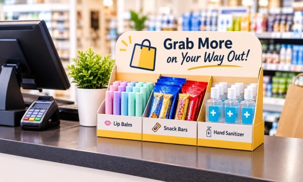
Summary: Explore ten effective retail checkout counter ideas that help retailers improve product visibility, encourage impulse purchases, and make better use of checkout space. Learn how display placement, product accessibility, materials, and structural design can create a practical checkout presentation that supports customer convenience while giving featured merchandise more opportunities to attract attention.
The checkout counter is one of the final opportunities retailers have to influence a customer’s purchasing decision. While shoppers usually enter stores with specific products in mind, their attention can shift while waiting to pay. An effective retail checkout counter setup uses this moment to introduce relevant add-on products, encourage last-minute purchases, and improve the shopping experience. The goal is to make merchandise visible, accessible, and appealing without creating clutter or slowing transactions.
Successful checkout merchandising requires more than placing inexpensive products beside a payment terminal. Product selection, display construction, visual hierarchy, and customer movement all influence performance. Here are 10 practical ways to make this valuable retail space more productive.
Impulse purchases are more likely when additional products relate to something customers have already selected. A beauty retailer, for example, might feature travel-size skincare products or makeup accessories, while a grocery store could display snack bars, batteries, or household essentials.
Choose compact products with clear uses and accessible price points. Reviewing transaction data can also reveal frequently paired products and seasonal buying patterns, helping retailers select merchandise based on actual customer behaviour.
Key Takeaway: Prioritize relevant, compact products that complement existing purchases and have demonstrated customer demand.
Product visibility depends on the customer’s position, viewing angle, queue direction, and surrounding fixtures. A display facing approaching shoppers can attract attention before they reach the payment terminal, while one positioned toward the cashier might go unnoticed.
Use a prominent product, contrasting colours, clear imagery, and concise messaging to establish a visual focal point. Pricing and product information should remain readable from the distance at which customers are likely to view them.
Key Takeaway: Position merchandise within natural sightlines and make its purpose and pricing immediately recognizable.
Checkout counters have limited usable space. Payment terminals, receipt printers, shopping bags, and employee work areas already compete for room. Oversized displays can obstruct transactions and make the counter feel congested.
Purpose-built custom counter display boxes can organize merchandise within a defined footprint. Open-front compartments, stepped arrangements, and angled product holders help present items clearly while keeping them accessible.
Design dimensions around actual product measurements, including packaging width, depth, and height. Also consider stock capacity: shallow compartments can cause products to fall forward, while excessive depth can hide items behind the front row.
Key Takeaway: Match display dimensions and capacity to the products and available counter space without compromising access or stability.
A checkout display should communicate its purpose within seconds. Too many competing messages can make shoppers overlook the offer.
Identify the primary product or promotion and position it prominently. Use supporting graphics to communicate one clear benefit, keep pricing easy to locate, and avoid unnecessary promotional text. Consistent colours, typography, and imagery help customers recognize the product and understand the offer quickly.
Key Takeaway: Give each display one clear visual focus supported by readable pricing and concise messaging.
Retailers should study how customers approach the register, where they wait, and which direction they face while paying. Products within the natural field of view can encourage browsing without requiring shoppers to turn around or leave the queue.
Displays must not obstruct payment equipment, restrict access to shopping bags, or interfere with cashier movements. Testing different positions along the checkout journey can reveal which placements attract attention while preserving transaction efficiency.
Key Takeaway: Place merchandise where customers can naturally notice and reach it without disrupting checkout operations.
Cross-merchandising connects products that serve related needs or are commonly used together. A stationery store could display pens alongside notebooks, while an electronics retailer might feature charging cables or screen-cleaning accessories near the register.
The connection should be immediately understandable. Grouping complementary products around a shared use or occasion creates a more coherent presentation than mixing unrelated items and makes the additional purchase easier to justify.
Key Takeaway: Group complementary products to demonstrate their practical value and encourage relevant add-on purchases.
Seasonal merchandise creates timely purchasing opportunities. Holiday accessories, travel essentials, and weather-related products can perform well when they match the store’s customer base.
Refresh displays before relevant shopping periods reach their peak, and remove outdated promotional messaging promptly. Interchangeable graphics, removable dividers, and adjustable compartments can accommodate changing assortments without requiring an entirely new fixture for every campaign.
Key Takeaway: Align display updates with seasonal demand and use flexible structures to simplify merchandise changes.
Packaging influences how shoppers perceive merchandise. Small products can be difficult to distinguish when their packaging looks similar or when items are poorly organized.
Choose formats that support quick identification, secure positioning, and convenient handling. Clear labels, visible product features, and appropriate dimensions make merchandise easier to browse. For compact retail products, counter display boxes for product visibility can keep individual units organized while presenting branding and key information toward customers.
The display should also account for product weight and packaging dimensions so stock remains stable as units are removed.
Key Takeaway: Treat packaging and display design as one merchandising system that supports visibility, organization, and easy product access.
Empty compartments, uneven product rows, and damaged packaging can quickly reduce a display’s effectiveness. Retailers should establish replenishment routines based on sales velocity and expected stock levels.
Material selection also affects performance. Corrugated board can be engineered with different flute profiles and board grades to accommodate varying product loads. Folding carton and paperboard work well for lighter merchandise and short-term promotions, while heavier products or longer display periods can require reinforced bases or more durable fixture materials.
Structural details matter too. Fold lines, locking tabs, joints, shelf spans, and support panels influence stability. Unsupported shelves can bend under product weight, while weak bases can lose stability through repeated handling. Prototyping and load testing help identify these issues before deployment.
Key Takeaway: Match material strength and structural support to product weight, display lifespan, and expected handling conditions.
Checkout merchandising should be evaluated through sales performance, not appearance alone. Retailers can monitor units sold, average transaction value, product attachment rates, and sales by display position.
Comparing a single-product display with a grouped assortment over similar trading periods can reveal which arrangement performs better. Keep pricing, promotional conditions, and stock availability consistent to make comparisons meaningful.
If a display attracts attention but generates few purchases, the issue could involve product relevance, pricing, accessibility, or unclear messaging. Regular evaluation helps retailers identify where adjustments are needed.
Key Takeaway: Track sales and product attachment rates, then use consistent comparisons to improve merchandising decisions.
An effective retail checkout counter setup combines relevant product selection, clear presentation, accessible display structures, and thoughtful placement. By considering shopper behavior alongside display dimensions, material strength, product visibility, and replenishment, retailers can make better use of this valuable selling space. Consistent testing and performance monitoring can reveal which arrangements encourage additional purchases without disrupting the checkout experience.
Looking to improve your retail merchandising with effective packaging and display solutions? Bling Bling Packaging and Display offers custom packaging and display solutions designed around your product and retail requirements. Contact Bling Bling Packaging and Display to discuss your project.
A retail checkout counter display encourages impulse purchases by presenting relevant, easy-to-access products near the point of payment. It helps retailers highlight complementary items, promote seasonal merchandise, and increase average transaction value.
Compact, affordable, and frequently purchased products generally work well at checkout counters. Examples include travel-size toiletries, snacks, accessories, batteries, stationery, and small personal care items. Products should complement the store’s main merchandise and appeal to its target customers.
Retailers can improve visibility by positioning products within natural customer sightlines, using clear product labels, creating a strong visual hierarchy, and avoiding overcrowded displays. The display height and arrangement should also allow customers to identify products easily while waiting to pay.
The right display depends on product dimensions, weight, available counter space, and merchandising goals. Countertop display boxes, tiered displays, and compartmentalized organizers are useful options for presenting compact products while keeping them accessible and organized.
Retailers can evaluate checkout displays by tracking units sold, product attachment rates, average transaction value, and sales across different display positions. Comparing performance over similar periods helps identify which products, placements, and display arrangements generate better results.